Making Sense of Color When Designing a Home

Source: paintandpaperlibrary.com
Making Sense of Color When Designing a Home
by SweisKloss
August 5, 2021
by SweisKloss
August 5, 2021
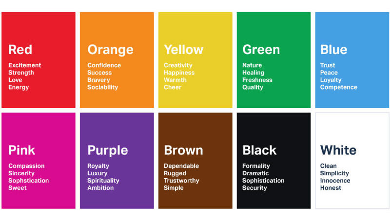
Source: usertesting.com
Source: paintandpaperlibrary.com
Source: usertesting.com